New Jersey I.D
The New Jersey ID, or NJID, displays a digital driver’s license ID for NJ residents, emphasizing medical accessibility and ease of use.
UX/UI
UI Animation
Research
Year
2022
Tools
Figma || After Effects
The Result
Fun and Secure
After a lot of iterating I had come to the conclusion that the geometry and natural theme, did not mesh well. Instead, I went full force wth the geometric dark theme, while using blue tones to ensure a feeling of security.
medical ID mockup 1

The Problem

Design Clutter: A costly oversight

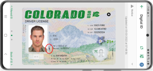
If you were to take a look at your ID right now, you might notice that there is no medical identification. Not only that but the design is unorganized, cluttered and if you forgot your ID it can turn costly, fines range between $75 - $300. This would not be a problem if you had a digital I.D.

Competitive Analysis

Medical ID: Ignored?

Through my research, I listed each competitor's strengths and weaknesses. The competitor's designs showed little emphasis on medical IDs and specific medical conditions. Therefore, I wanted to make my project a more effective and accessible option for users who need it. Below, I will show a summary of my analysis.

Colorado
Strengths
Affinity Icon
Disability Identifier Symbol
Two Step Identification
Weaknesses
Horizontal Landscape only
Disability Symbol does not specify medical condition
Louisiana
Strengths
Touch ID option
Remote Verify
License renewal alert
Weaknesses
Scan feature is hidden
Lack of security
Utah
Strengths
Tap to verify
Standards used outlined by the American Association of Motor Vehicle
Weaknesses
No accessibility features offered
Sketches & Wireframes
Nature vs Geometry

When looking for inspiration, I tried to see what makes people think of NJ, and what felt secure at the same time. I decided to experiment with a floral and nature-themed board, and a darker, more geometric-based board.

Sketches
Wireframes
Iterations
Finding the best solution

During the iteration stage, I messed around quite a lot in order to find the right solution and color palette as well. In the beginning stages of my iteration, I did my best to mix elements from nature, such as using round corners, soft colors, and a less rigid design, while maintaining accessibility. Towards the end of my iteration stage, I started incorporating more geometric patterns, along with a design that would be more realistically used in a government environment.

Iteration 1
Iteration 2
Iteration 3
The Outcome
Making it better
While I achieved the goal I had, making a physical drivers license physical, with focus on medical information. There are still several elements that still needs improving that I am currently working on.
Adding more dimension to each screen
Open UI animation for button presses
Background pattern
Related Projects
Check out what else I’ve been working on!
Chatham Financial
Summer Internship
Design System
UI Micro-Animations
Wanna die in America?
Raising awareness of the U.S. Healthcare System
Website
UX/UI
Research
View all