Contents
Overview
Dark Mode
Preference Testing
Retrospective
The problem at hand was that the existing save button had minimal indicator states, making it difficult for users to understand whether their actions were completed or not. To resolve this, I iterated different ways the save button could look, making sure the animation gave clear feedback to users, while also ensuring I followed the color guidelines.

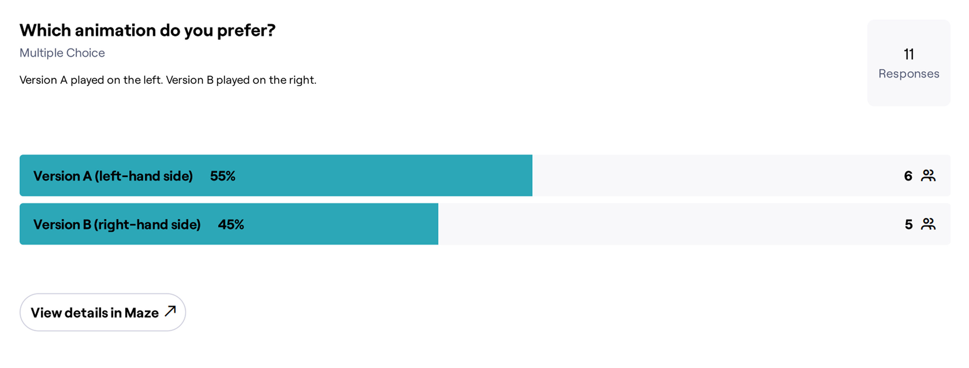
Imagine clicking on a card, but not being sure where it went to afterwards. That is what me and my fellow intern aimed to fix. Our early concepts explored different indicator states, but user feedback revealed that it still wasn’t clear enough. This led to two final micro-animations, and AB testing which demonstrated that Version A significantly improved user understanding of card actions.
Version B
Current Version - Version A